Fork App
Project Overview
Fork is a start-up and mobile app aimed to help UCLA students who eat at the dining halls healthily monitor their diets based on their fitness goals and favorite meals. We want to provide a healthy eating companion for students!
Role
Product Designer
Timeframe
May 2023 - June 2024
Skills
Product Design, UI Design, UX Design, Information Architecture, Design Systems, Branding, User Research
Team
- Joe Camyre (Founder)
- Joycelyn Ng (PM)
- Ryan Kim, Jordan Conklin, Ryan Yang, Wonjin Lee (Dev)
- Joy Wu (PMM)
- Andrea Wu (Design)
01 / Understanding the Problem
UCLA Students are Falling Short Trying to Navigate Nutrition
At UCLA, students want an easy way to track their diets and maintain healthy eating habits, but the dining halls provide nutrition information inefficiently. And it seems UCLA students are not alone in their nutrition struggles. The current UCLA Housing app complicates meal planning and nutrition tracking.
So, why not create a new app to help students integrate their diets with their meal plans?
From there, we set out to help our fellow students and set a powerful goal…
Getting the Scoop From the Students
From interviews with 20+ students, two main blockers seemed to be stopping students from eating healthily, and they aligned with our research:
01 / Navigation
02 / Decision Dilemma
When asked “What are your experiences looking at the dining hall food options?”, 70% of students mentioned the confusing navigation of the UCLA Housing app.
When asked “How do nutrition facts impact your meal choices?” 75% of students stated that it is hard to find and understand nutrition facts for the meals they’re eating.
As a followup, we asked “Does this impact your meal choices?”, and 2/3 of these students responded yes.
Based on the data we collected from these students along with the audience we were hoping to target with our app, I developed two user personas that would help ground my designs in our users’ needs:
Our Goal: Creating a Solution to Empower Healthy Eating
🌟 Create a mobile app to help UCLA students who are having trouble planning and eating healthy, balanced meals and the dining hall, and ensure that their diets are complimenting their personal lifestyle habits.
What’s Already Out There?
Taking a look at other apps that claimed help meal planning, I focused on solving the primary issues of finding healthy meals efficiently. After using each app for a week, I complied their strengths and weaknesses to better understand each app.
02 / Defining the Goal
Competitive Analysis
Navigating the Navigation
I wanted to be sure of the information architecture of the app before designing, so after sitting down with Joe and Joycelyn, we created a general flow of how we wanted the app to function:
Creating an Account
Strengths
Weaknesses
Basic App Navigation
User Flows
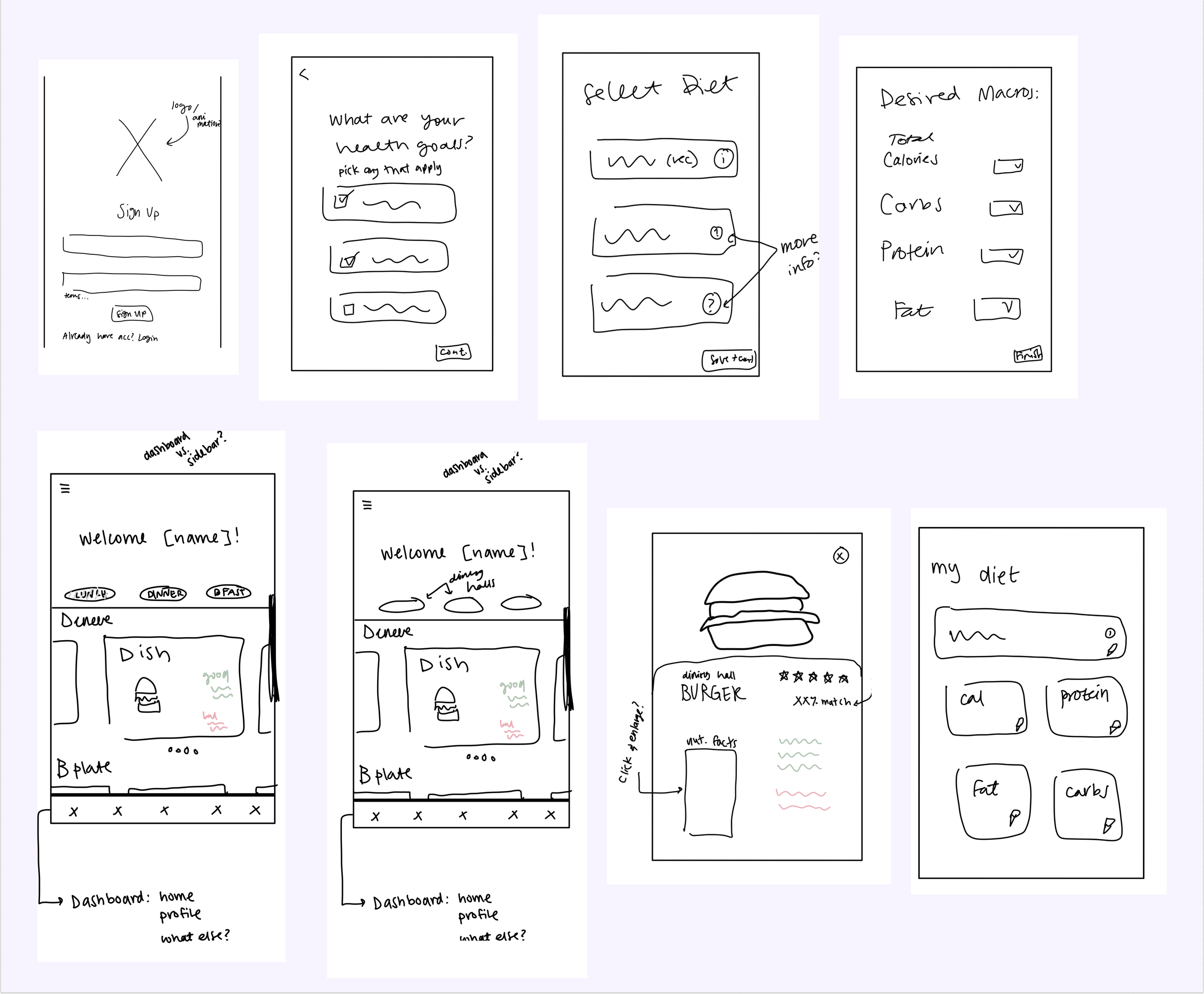
Initial Sketches & Wireframes
Presenting a super messy, barely-understandable first sketches! These first sketches and wireframes were all about figuring out the best layout of our app, and because it was important that we got all of those ideas got drawn out, even if it was a little messy. But all great designs must start from somewhere…
First Screen Sketches
Extremely Lo-fi Wireframes
Design Systems & Components
⚠️ I did not have a good understanding of setting up a design systems when beginning the designing phase. It took lots of revising to make a real system, but I’m glad I did so that the devs find it easier to translate my design to code :)
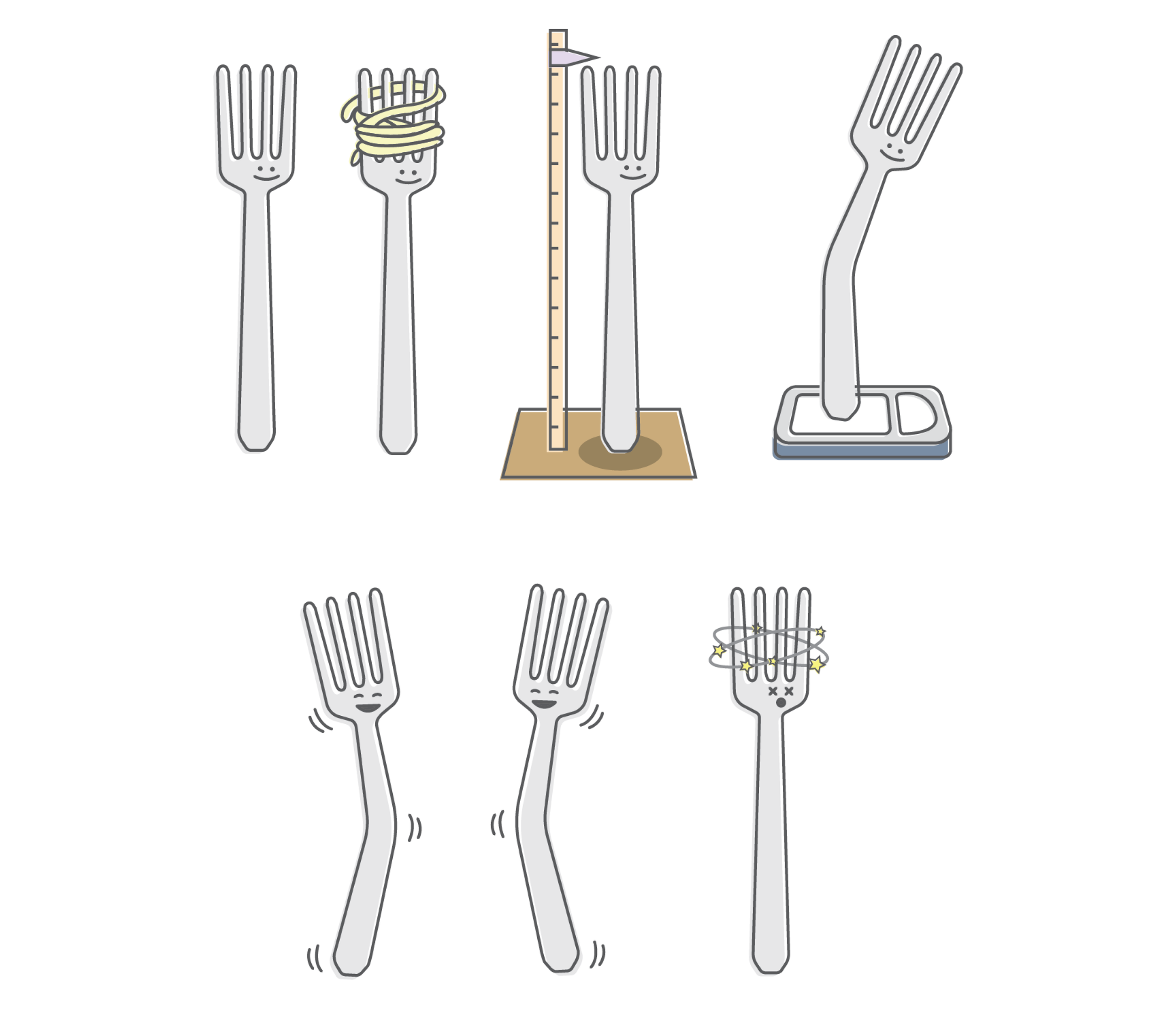
Logo & Branding
Because out app is meant to support healthy eating and dieting habits, I wanted the app’s logo and branding to reflect this. I began with an egg before we had a solidified app name and then iterated through logo designs until landing on the multitude of forks there are now!
Original Logo Designs
Current Fork Logos
03 / Let the Designing Begin!
04 / Iterations & More Research
After developing initial sketches, wireframes, and a cohesive design system, I designed prototyped versions high-fi screens. However, to make sure that these designs completely catered towards users, the product marketing management team and I conducted user surveys and interviews with the prototype to fine tune my designs.
User Testing: Surveys, Interviews, Prototypes
Though my initial high-fi screens were based in research, it was really important for us to get more research and see the prototype in potential users’ hands. With the help of the PMM team lead by Joycelyn, I conducted user interviews with the prototype to see pain points. I help conduct a total of over twenty user interviews. To track our notes and create a new, cohesive user journey, we used TheyDo.
Pain Points
⚠️ Using TheyDo took a lot of getting used to, but after getting the hang of how it worked, I’m glad we learned how to use it because it made taking notes much easier. Thank you to Joycelyn for taking the time to teach me and the PMM team how to utilize it! It became really helpful to pinpoint painpoints across several interviews.
Iterations
After interviewing and surveying all of our potential app users, here are some of the most common pain points we discovered:
✦ basic info sign up- specify exact age/weight
✦ allergies- enter own
✦ homepage- dish cards too tall, too much scrolling?
✦ profile- see tracked macros
✦ users preferred to enter exact age, weight, height, etc., and developers found it easier to scale exact information when executing designs
✦ users would rather have each step on its own screen for less clutter than concisely in one screen
✦ incorporation of new Fork logo to promote friendliness and safety!
Basic Info Sign Up
✦ mainly suggested by PM Joycelyn
✦ users can input their own allergies if it’s not one that is listed
✦ promotes inclusivity and safety— we don’t want anyone having an allergic reaction because of our suggestions!
Allergy Specification
✦ placards for dishes too tall— shortened to reduce excessive scrolling
✦ separate recommended and ‘search by dining hall’
✦ search bar to find specific dishes quicker
✦ for the future: incorporation of restaurants?
Homepage
Profile
✦ incorporate ability to track macros (future feature)
✦ still figuring out how to incorporate a calendar feature
This page is a continual work in progress. As we continue to incorporate new ideas to Fork, this page is changing to accommodate them ;)
Working Prototype:
05 / Reflections & Learnings
Working on Fork has been one of the most gratifying design projects I’ve worked on! Seeing beta prototypes in users’ hands and their feedback was extremely gratifying. Although Fork is no longer in production due to funding complications, I’m so glad I’m able to have been part of such a meaningful project as well as such a passionate team at Fork.
The main challenge was accommodating all of our user preferences while also staying on track for our beta launch of the app. Though it always seemed like there are things we want to add to the app, it takes continual effort to take a step back and create sustainable, realistic goals. However, if I had more time to make improvements on my designs, I would want to continue fine-tuning the working prototype and incorporate a way to track macros!
Thank you again to the team at Fork and Joe!


